Case study
Dallas Homestead Exemption Map
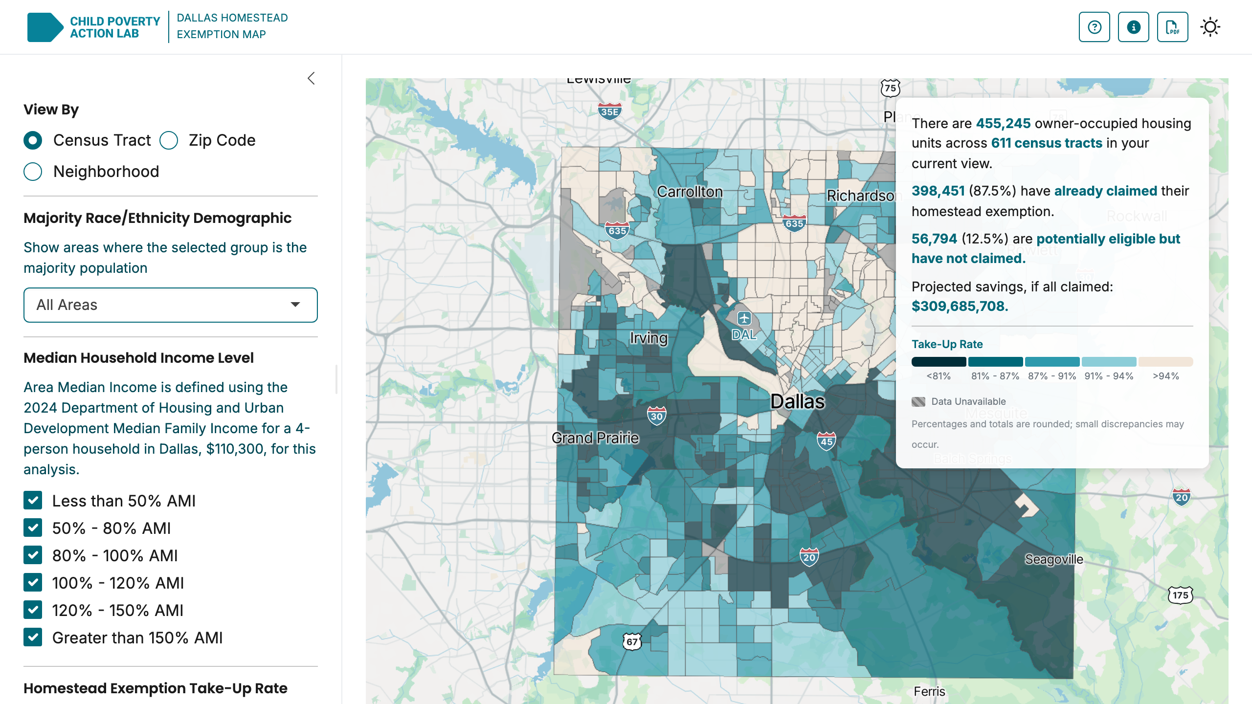
Interactive map visualizing homestead exemption take-up rates across Dallas.
Problem
The Texas homestead exemption is a meaningful property tax break, for households that claim it. In Dallas, the exemption can save a family hundreds to thousands of dollars per year, and stacking it with the over-65 or disability exemption multiplies that.
But take-up is uneven. Some neighborhoods file at near-universal rates. Others, often the same neighborhoods with the highest housing-cost burdens, leave the exemption on the table. The disparity is visible if you can see it, but Dallas Central Appraisal District (DCAD) data is published in a form that doesn't surface it. There was no public tool that let advocates, policymakers, or residents see who was claiming and who wasn't, broken down by neighborhood and demographics.
Without that visibility, outreach campaigns to expand take-up were essentially flying blind.
Approach
I built an R Shiny application that joins DCAD parcel data to American Community Survey demographics and renders the result as an interactive choropleth across three geographic scales (census tract, zip code, and neighborhood) with equity-focused filters.
The tool lets a user:
- See exemption take-up by tract / zip / neighborhood across the entire county
- Filter by race/ethnicity composition and household income to surface disparities
- Compare year-over-year changes to track the impact of outreach efforts
- Download the underlying data and a summary report for further analysis
Three design decisions shaped the final product:
- Equity defaults. The default view doesn't ask "where are exemption rates highest?" That question is uninteresting. It asks "where is the gap between high-burden households and exemption take-up largest?", which is the question the tool exists to answer. Default framing tells the story.
- Color scale honesty. Choropleth color choices can mislead. We chose a single-hue ramp anchored at the county median to make over- and under-take-up visually symmetric, rather than a divergent scale that implies a "right" rate.
- Multiple geographies. Tract-level data is statistically cleaner; neighborhood-level is more legible to non-technical users. We supported both rather than choosing one.
Hosted at dallashomesteads.tools.cpal.org with public access. No login, no friction.
A data tool is making an argument whether you intend it to or not.
Outcome
The tool is built for Dallas housing advocates working to identify neighborhoods where outreach can have the highest impact, for policymakers evaluating proposals to expand exemption access, and for residents who want to check their own neighborhood's exemption rate.
It exposes downloadable reports and open data for journalists and researchers covering Dallas housing affordability. Internally at CPAL, it sits alongside other equity-focused analytics tools that support program design.
Reflection
Two things stuck with me after building this one.
The default view does a lot of the talking. Which layer loads first, how the color scale is anchored, what a tooltip shows: each of those quietly points the user toward a conclusion. Show take-up rates on their own and the rate reads as the point. Show them next to household income and the question becomes who's getting left out. Same data, different takeaway. There was no way to build this without making those calls, so I made them on purpose and wrote down why.
An interactive map also lands differently than a static report. A PDF of exemption disparities is easy to skim past. When someone can pull up their own zip code and see the gap in their own neighborhood, they tend to sit with it. That's most of why this is a tool people can poke at rather than a chart in a slide deck.